OVERVIEW
Everything you've wanted in a book platform, all in one place
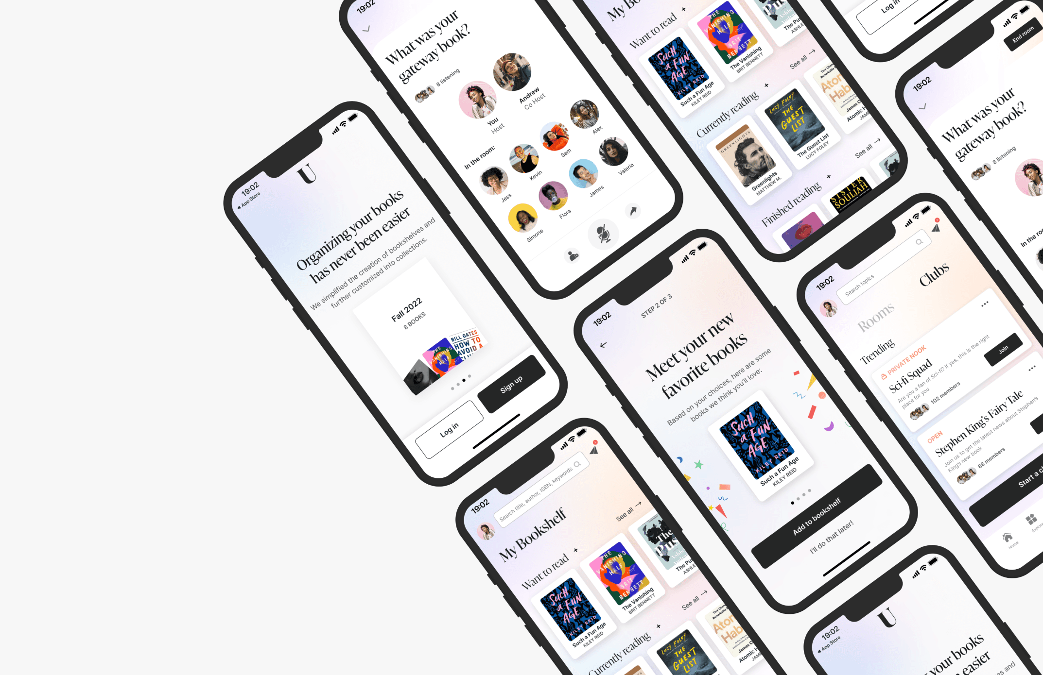
Unconvo is an all-in-one community platform that lets readers discover, organize, and discuss their favorite books with like-minded readers. Currently, Unconvo is an exclusively browser-based platform with no native app counterpart. In this project, I designed an MVP of the end-to-end application, allowing users to complete the core experience of discovering books, creating a library, and engaging with other readers.
PROBLEM
Readers lack an efficient way to find and discuss books with others
The book world has long been neglected; the literary community has no true home on the internet. Most existing book forums are solely built for postings and nothing else goes beyond that. Gen Z readers, the mobile-first generation lack an accessible, efficient way to discover new books, track their reads, engage in collaborative discussions, and foster meaningful connections with fellow readers.
SOLUTION
iOS app design: Incorporating a unique mobile-first value proposition
With the need for a more scalable solution beyond existing web-only experiences, I’m exploring a mobile application solution that will bring like-minded readers together, transform reading by creating a shared, social experience around tracking, reading, and discussing books, ultimately bridging this gap between the book space and technology.
View final prototype
PRODUCT STRATEGY
First, analyze the current product landscape
My favorite aspect of this project was collaborating closely with team members with weekly all-hands meetings, design crits, and follow-ups to define the app and project requirements. Together, we defined priorities and set out the product goals and roadmap.
From these discussions, I have learned that the overarching objectives of Unconvo are:
Putting users first
Taking the core product to the next level by building something readers love. Users’ best interest is their best interest.Bringing value to users fast
Caring a lot more about what they can bring to users fast than they care about making something perfect.Focusing on the smaller market at first
Targeting Gen Z fiction readers, who are majority women and will slowly expand to more audiences over time.
RESEARCH
Existing products addressed some of the pain points, but no one product did it all
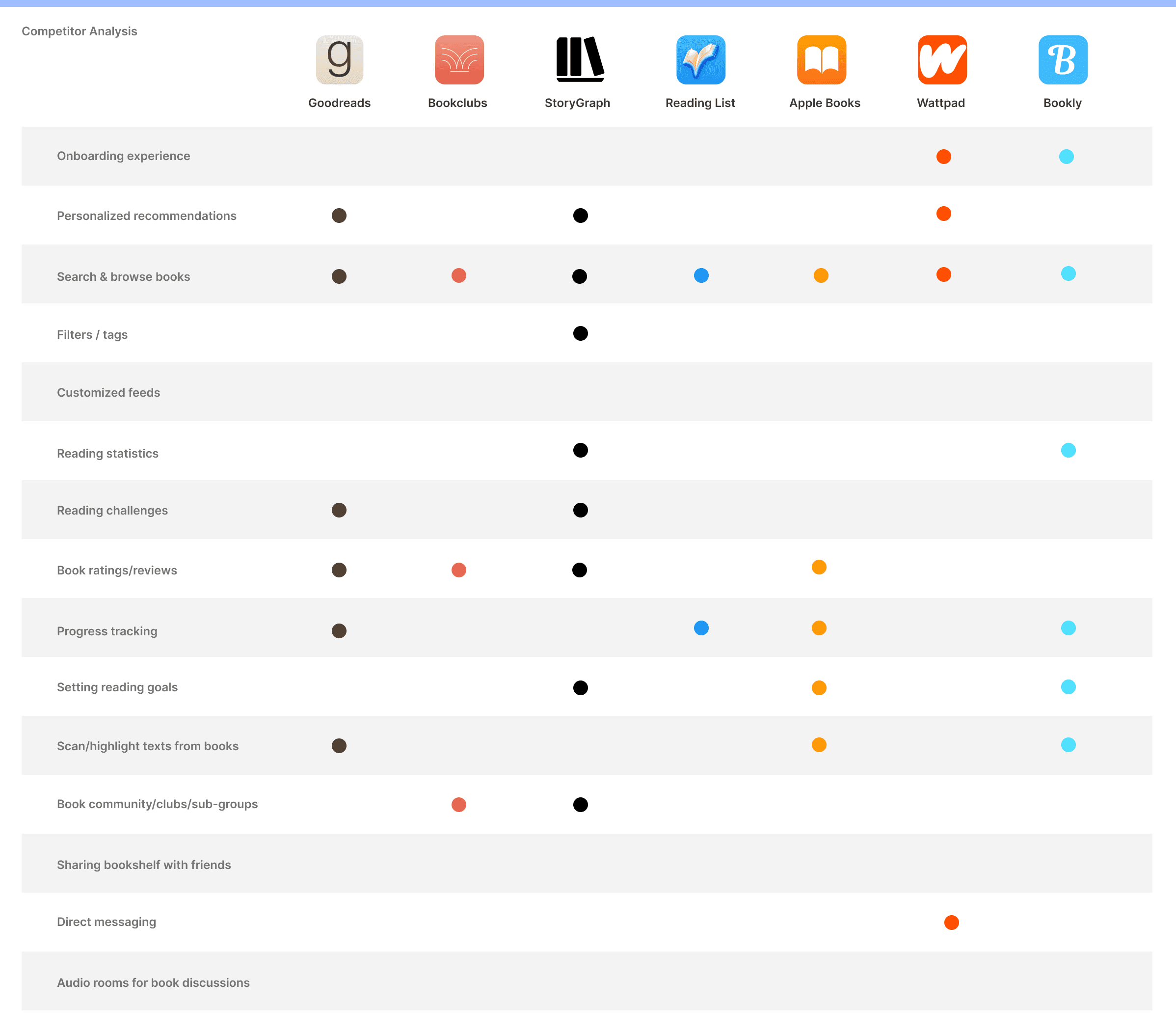
To familiarize myself with the book space, I started by analyzing our primary competitors, book-specific subsets in the current community, and some other relevant incumbents. Through research, I realized that most of them offer very limited features or only serve certain purposes. There wasn’t an “all-in-one” book platform with comprehensive features, much less any social elements.
USER INTERVIEWS
"It is better to build something 100 people love rather than something 10,000 people kinda like."
A beta release of the browser version of the new platform had been implemented last year but was created without any proper usability testing and had very little to no consideration for the technical and product limitations on the scope of work.
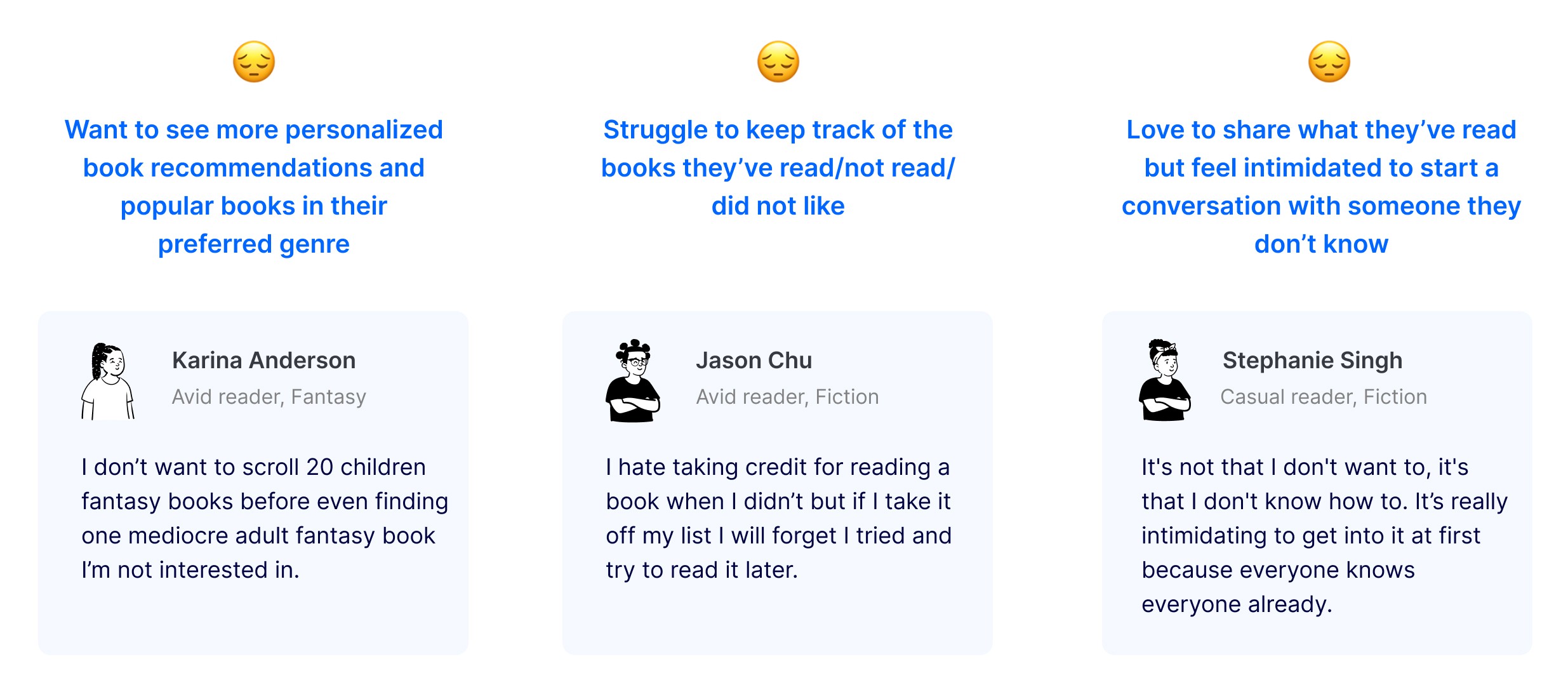
Thus, I tasked myself to interview six beta users from ages 18 to 25, who are avid fiction readers with the goal of understanding their needs and frustrations they had when experiencing the beta release, and around reading, tracking, and discussing books.
To help synthesize my interview findings, I created an empathy map. I was then able to uncover interesting insights that helped set the design direction and key potential features I should be designing for.
USER PERSONA
From a reader's POV
Now, meet Danielle who is representing common traits, goals, needs, wants, and pain points among users that I identified through user research. As I proceeded further in the process, it helped to have a tangible reminder of the people I was designing for. The storyboard also helped me visually predict and explore Danielle’s experience with the app.

DEFINING THE MVP
How might we make reading truly social?
Collaboratively, we mapped out our potential solutions by going through each step of the task flow and asked ourselves “How might we” find design opportunities, followed by gathering inspiration. I enjoyed this part because it allowed for creative thinking and bringing in new, bold ideas that have never been tried before.

CHALLENGED WITH TIME & TECHNICAL CONSTRAINTS
Centering the core experience on the “must-have features"
Initially, we had the idea of giving book recommendations based on users’ current moods. It was a proposed feature that looked simple and fun on the app. However, after discussing with the engineers, we learned that it would require a whole smart system behind it which needs to estimate for example, how “lighthearted” or “funny” books are. Unfortunately, we didn’t have that and weren’t in a place to develop it.
We were also challenged with meeting the deadlines. This led us to think about the product more intuitively to determine the right core features we wanted to successfully attain for the app.
The questions we asked ourselves:
Is this feature addressing a major user problem?
Is it validated by users?
Is it solving problems, or creating problems?
Any technical feasibility issues?
DESIGN OPPORTUNITY #1
Incorporating personalization into onboarding
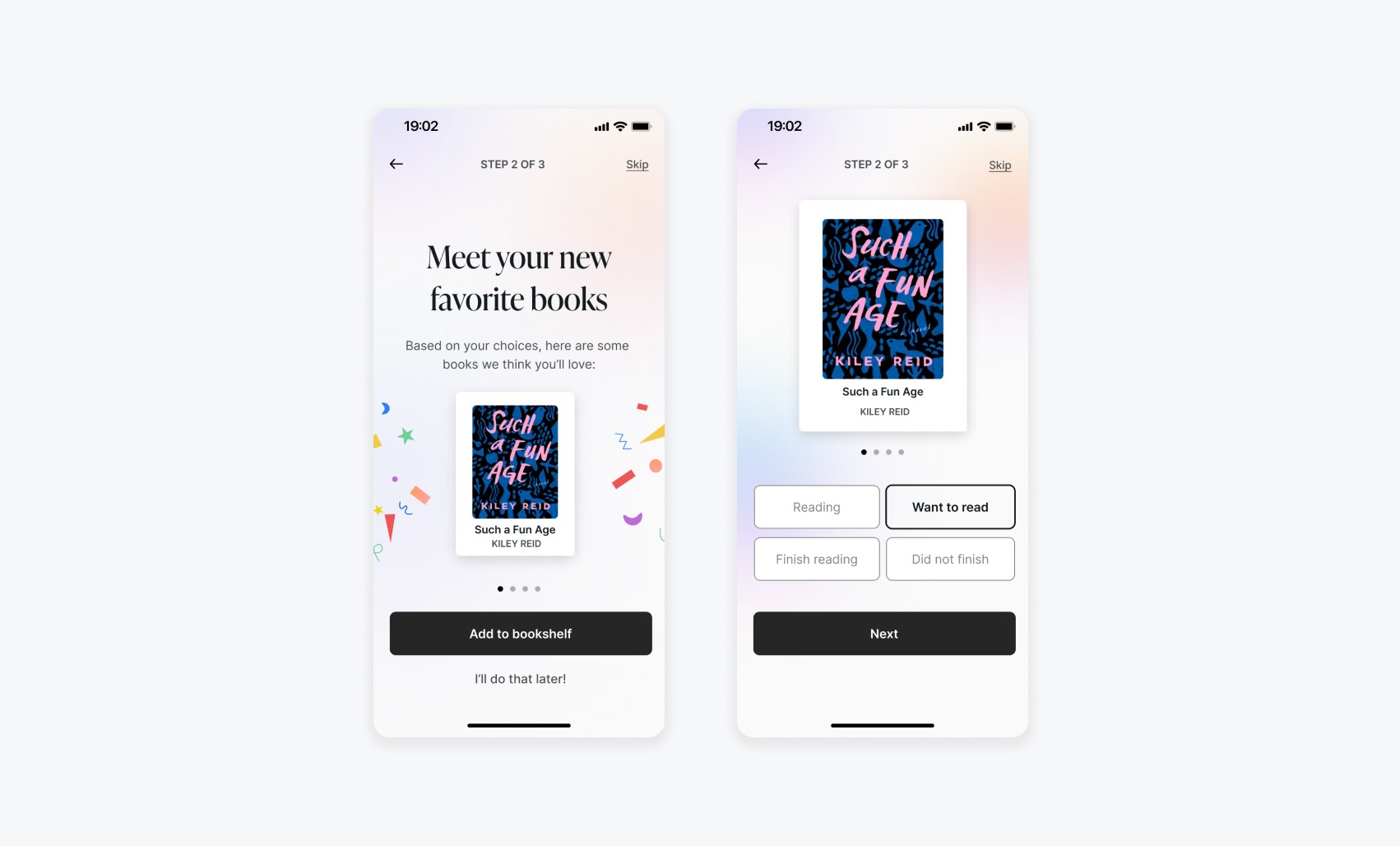
Personalization is an excellent way to improve activation and retention, and incorporating that into the onboarding process gives new users a guided and welcoming experience for faster, more meaningful, and personal book recommendations based on their preferred genre.
The time to make a decision increases with the number and complexity of choices. Instead of asking users to select the genres they like from a long-scrolling list (Round 1), we give them two much simpler, actionable, and interactive options to choose from (Round 2):
A two-step import of their Goodreads library
Simply tell us a few books they’ve read recently
From their input, we will be able to know what genre they are into and recommend books based on the popular books of that genre and similar books by other authors.

Users value something more if they feel it’s theirs. In this case, knowing that the book is saved in the “Library” encourages users to stick around until the very end and complete the onboarding.
DESIGN OPPORTUNITY #2
Redesigning the way users organize their books
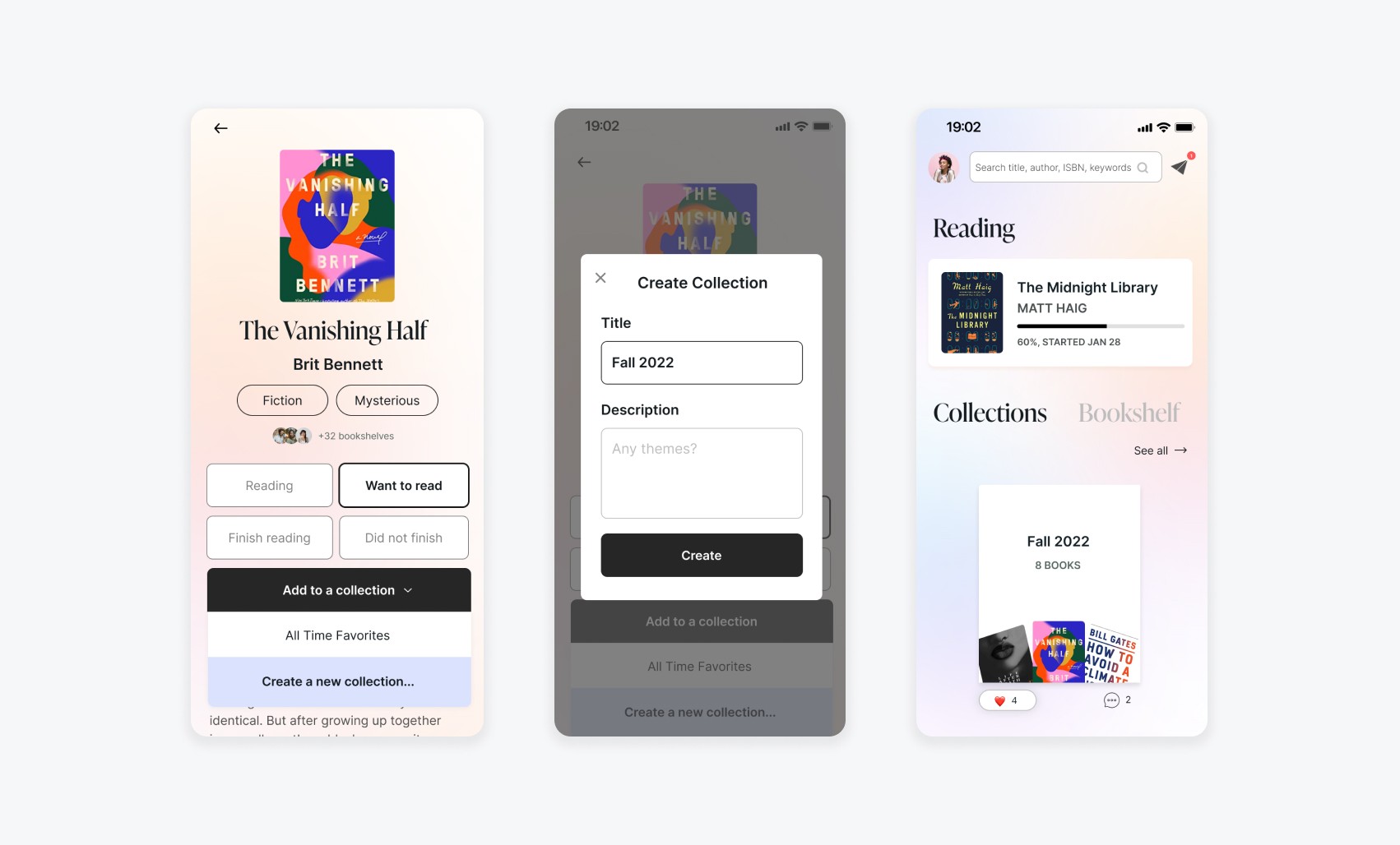
In order to differentiate ourselves from our competitors, we redesigned the way readers organize their bookshelf and introduced an extended feature that allows readers to display their favorite book collections.
Prior to beginning design, I spent time studying our primary competitors’ key features. I noticed that most of them allow readers to organize their books by reading status: read, reading, and want to read. While this appears to be a standard feature to have, our user research revealed that they wish they could track books they did not like as well.

So, how do we make this better? Instead of marking a book that users did not want to finish as “Read”, we added an additional status “Did not finish” to track books they did not enjoy so that they won’t try to read it again later.

During my research, I discovered an interesting insight that for most users - looking back on the books you've read can be a nostalgic sense of accomplishment.

This sparked the idea of the extended feature: “Collections”, where readers can create and customize their book collections and display their favorite books at all times.
DESIGN OPPORTUNITY #3
Inspired by Clubhouse, creating a digital bookclub in the ecosystem
I discovered two opportunity areas through my interviews:
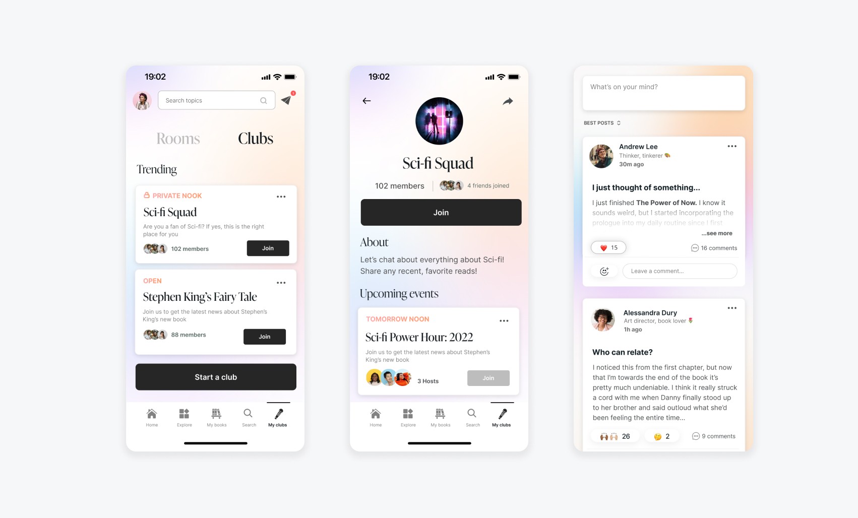
Readers love to share their content casually, such as direct quotes, photos of the passage, or just food for thoughts
Instead of starting a conversation out of the blue, most readers feel more comfortable being in a group setting first where they can simply observe and listen to others before engaging.
Inspired by Clubhouse, Unconvo can incorporate audio rooms into their ecosystem to hold events, facilitate book discussions, getting closer to a true book club feel. This helps make the experience feel more inviting, personal, and inclusive.

USABILITY TESTING
So, what do the users say?
From the usability testing, I received mostly positive feedback on the overall navigation and usability. However, the main friction point has risen:
It was unclear what an audio room or book club meant and how to navigate both.
With the high-level product goals in mind, I brainstormed potential solutions for better introducing the audio room and book club feature:
Solution 1:
Introduce the feature as part of the onboarding process
Solution 2:
Add a prompt message on the home feeds when there is a live room going on
Solution 3: Notify users through inbox messages or notification
I chose to combine solutions 1 and 2 for a few reasons:
1. Inbox messages or notifications might be overlooked by users who don’t check their mailbox often
2. Prompt messages are less intrusive and able to get the message across in a more subtle way
3. Incorporating it into onboarding helps users develop an understanding through task-oriented design

DESIGN SYSTEM
Enhancing the UI to add warmth
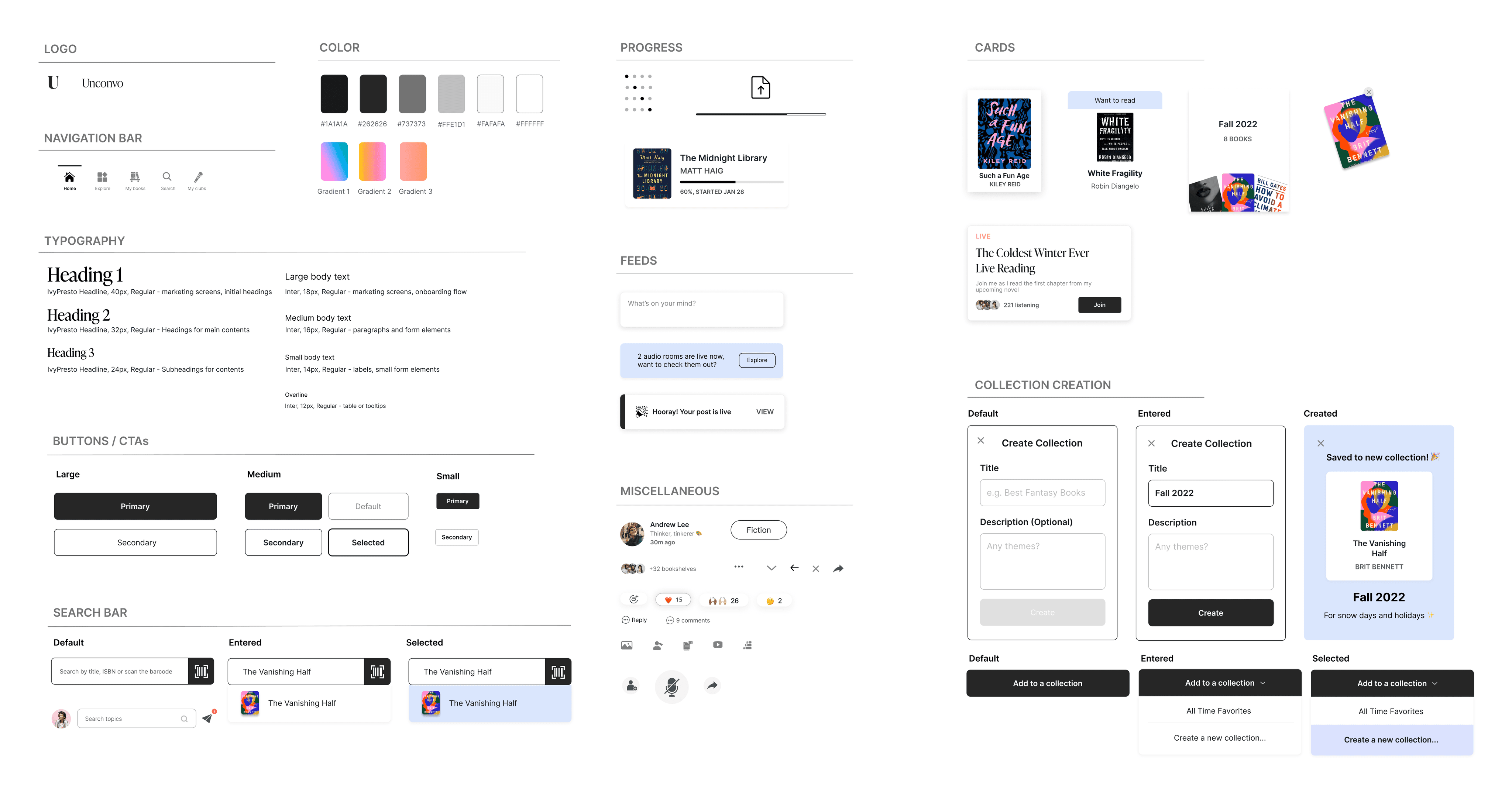
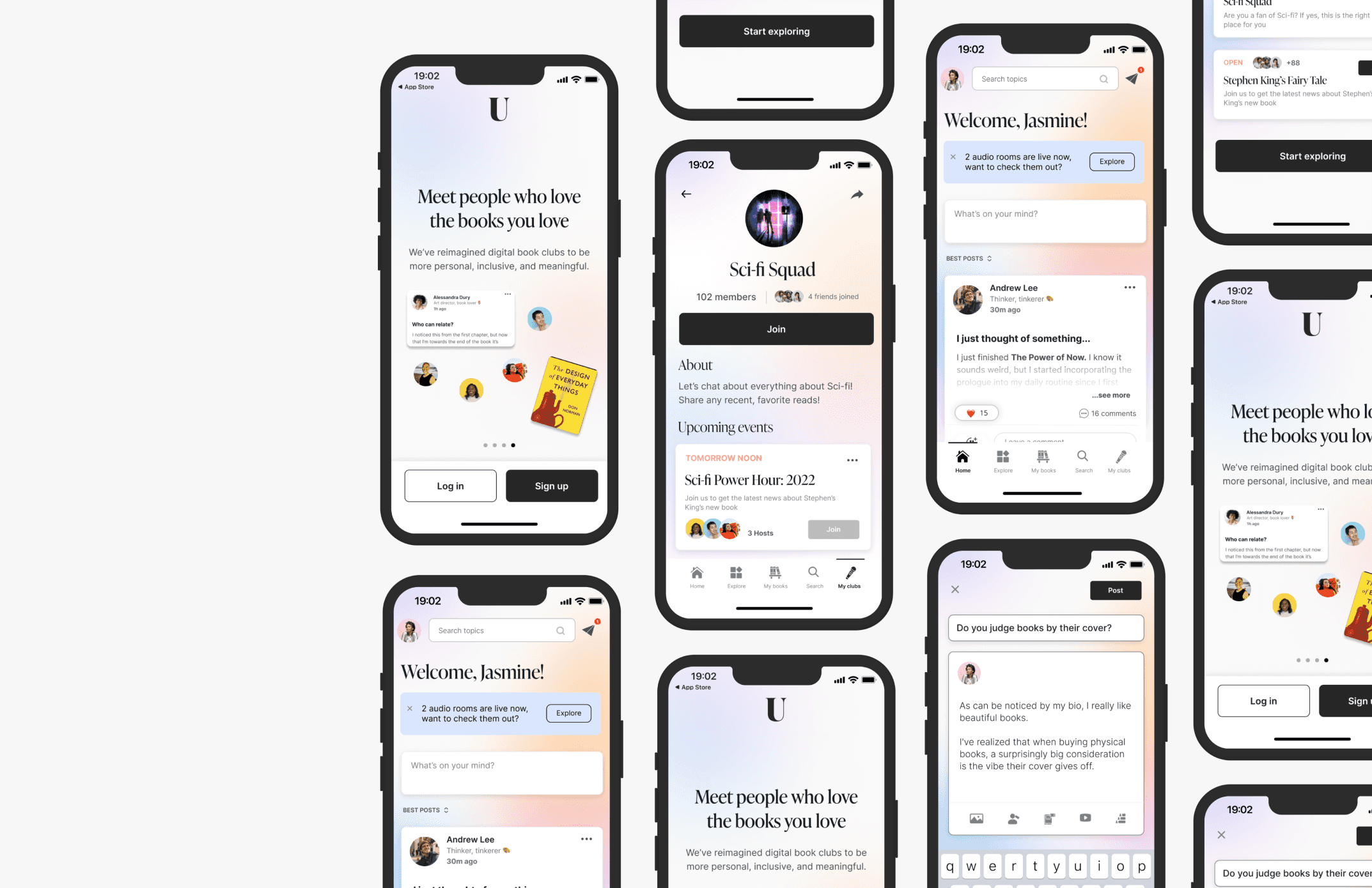
Through my research, users expressed that most of the existing book apps have very plain user interfaces, while it’s visually calming, they wish they had a more vibrant color theme. We, therefore, enhanced the UI to incorporate more colors, other than just beige, and applied a colorful gradient blur effect to our background to add more warmth, cheerfulness, and energy.
After familiarizing myself with Unconvo’s existing design system and learning how to effectively reuse components and symbols, I became immensely more efficient in my design. I also compiled a list of the new elements and components that the engineers would need to build as well as incorporate that into their system for future reference.
IMPACTS
Beta launched in Nov 2022
By the time the beta was launched, I had already left the company so I wasn't able to gather any data. But I know startups only have one north star metric that defines everything else. For Unconvo, it is active users and it breaks down into four core metrics:
Acquisition: How many new users did we get this week?
Activation: Of the new users, how many actually went through onboarding?
Retention: How many users from past weeks have come back?
Activity: What exactly are people using? how many new posts do we have, how many books were added, and how many collections were created?

NEXT STEP
If I had more time…
Explore and design a more meaningful and differentiated review and rating system beyond what’s currently available as the classic 5-star book rating system may lack nuance and context
Build a reliable progress and goal tracker that motivates users to set up reading challenges (with friends), achieve their goals, and build a better reading habit
Dive deeper into the community feature and find creative ways for readers to interact with and further support the authors they love
LAST THOUGHT
What have I learned?
Design is never done. At Unconvo, I learned that “finished” may look great in a portfolio or on Dribbble, but in reality, what makes a digital product great isn’t a finished design that’s delivered to pixel perfection – it’s the ability to adapt and grow, to pull together iterative releases into a product. That means frequent design critiques, constant feedback, and testing with real users.
Through the wise words of my design mentor Farhad Qazi, I realized how easily designers can become attached and unconsciously get defensive when faced with adverse opinions. However, I see this as an opportunity for me to grow even more rapidly by attentively listening to differing opinions even deeper and actively seeking after the why’s and how’s of others’ thought processes. This really resonated with me early on, and I’ll be taking this sounding advice with me as I go on my design journey.
The confidence in my designs I’d gained at Unconvo was truly a valuable experience. Not only do I learn to embrace ambiguity, continue to be curious, ask insightful questions, and push for new ideas, but I’m also not afraid of our design experiments failing and embracing them as long as we can learn something from them.
